Why It’s Time to Move Beyond Responsive Grids and Start Designing with Intent
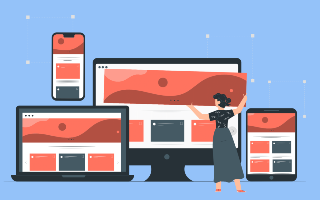
The preferred method for creating websites that function on various devices has long been responsive grids. They guaranteed that our designs could adapt to changing screen widths and provided us with respite from cumbersome, fixed-width layouts.
The fundamental debate, though, is whether responsive grids actually improve user experiences or if they only make content fit.
Responsive layouts frequently only resize items without truly adjusting to the demands of the user. And it is an issue. Because designing a website that works well at all sizes is more important than simply making it fit in.
"One-Size-Fits-All" Layouts' Drawbacks
The basic idea behind responsive grids is to automatically adjust their structure according to the width of the screen. It sounds ideal, doesn’t it?
However, the truth is different.
In order to push items into boxes, responsive design frequently handles information like a puzzle by stacking, decreasing, and rearranging them. The outcome? Layouts that are functionally incorrect but visually correct.
Consider typography. On a mobile device, a bold headline that looks great on a desktop computer can look awkward and unattractive. Reducing the font size is insufficient; the entire text strategy, including font weight and spacing, must be altered for mobile screens.
The same is true of pictures. Is that meticulously crafted hero shot? It is frequently reduced to a perplexing crop on mobile devices, completely missing the point.
The dreaded vertical scroll comes next. Important components like CTAs or sidebars are buried far below the fold in multi-column desktop layouts that turn into mile-long mobile sites.
Thus, responsive grids do really “work.” But do your users find them effective? Not all the time.
What's Absent? Content Knowledge.
The way we use the grid is the problem, not the grid itself.
A grid is not a panacea; it is merely a tool. Designers need to shift toward content-aware responsiveness—designing with purpose rather than just fluid dimensions—if they want to make a significant effect.
This implies:
1. Rewriting headlines for smaller screens, not just shrinking them 2. Making layouts with lots of images simpler rather than smaller 3. When necessary, deleting or concealing unnecessary content 4. Steer clear of artificial breakpoints and concentrate on content breakpoints, which are places where design fails either aesthetically or functionally. 5. Considering user objectives in addition to device widths
For example, a laptop user may be surfing lazily, but a mobile user may desire quick answers. That variation in intent should be reflected in your layout.
Design That Considers More Than Just Devices
The “just make it fit” mentality needs to go. Your layout should adapt rather than just react.
Rather than depending only on grids, pay attention to:
1. Contextual hierarchy: Modify the arrangement according to user objectives and reading comfort. 2. Adjustable spacing: Allow white space to flourish on mobile devices where density may become too much. 3. Ingenious visuals: Replace intricate pictures with easier substitutes or cropping. 4. Function-first UI: Give priority to quick access on mobile devices and a captivating desktop experience. 5. The Future: Adaptive, Intentional Design
Although responsive grids will always be useful, they are not a panacea.
Designing for several devices requires more than just scaling components. Prioritizing content, using strategic thinking, and having a thorough understanding of your audience are all necessary.
Because your website is an experience and a narrative, not just a collection of pixels. And it’s time to change your strategy if your layout isn’t improving that tale on each screen.
TL;DR
1. Although useful, responsive grids aren’t always significant. 2. Design should not only adjust for screen size but also for content and user purpose. 3. Thinking beyond technical fit is essential to creating superior experiences. 4. Design with intention rather than merely structure.


Leave a Reply